Data Analytics · Business Intelligence
Selected dashboards
Power BI Analytics
Interactive dashboards for marketing, sales, RFM analysis and operational control.
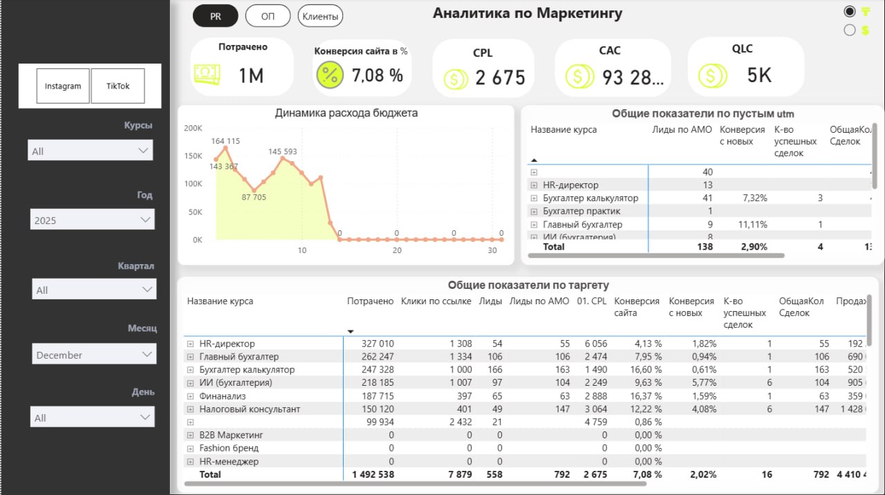
Overview
I turn fragmented spreadsheets and sources into a clear data model, a focused set of KPIs and an interface where teams can see performance and opportunities quickly.
Problem
Large spreadsheets explained what happened, but required manual preparation and made it difficult to understand causes or compare segments.
Solution
For each project I defined business questions, cleaned and connected the data, built DAX measures and designed a visual hierarchy from the main outcome down to product, time and segment detail.
How the system works
- 01Excel, CRM and operational sources
- 02Power Query transformation
- 03Data model and relationships
- 04DAX measures and KPIs
- 05Interactive filters and drill-down
- 06Business insights and monitoring
My role
- Requirements and KPI definition
- Data preparation and modelling
- DAX business measures
- Dashboard UX and visual hierarchy
- Validation with the client
Technology
Impact
4
analytics directions
1
unified view of performance
Live
interactive exploration
Dashboard gallery
Lessons learned
A strong dashboard does not show everything. It creates a path from the important signal to its cause and supports a specific decision.